Five Ways to Reduce Donation Form Friction
It’s no secret that online giving continues to be one of the fastest-growing and most impactful channels for nonprofits of all sizes. But despite this growth, there’s a persistent challenge that quietly erodes the donor experience and undermines fundraising potential: donor friction.
If you’ve ever wondered why some people abandon your donation page at the last minute or why a seemingly straightforward giving process ends up underperforming, chances are friction is playing a significant role. Below, we’ll explore what donor friction is, the most common types of friction slowing down your supporters, and how you can address each one to unlock more donations.
What is donor friction?
“Friction” is any element in the donor journey that causes a potential supporter to hesitate, get frustrated, or give up on completing their gift. It can include anything from a lengthy form, to confusing directions, to extra steps in the checkout process. Every second someone has to wait or every additional field they have to fill out increases the likelihood they’ll exit your page without making a donation.
In the context of online giving, every little obstacle matters. Minor issues like an extra step in the process or a slight delay in loading may seem insignificant, but collectively they can lead to a substantial drop in conversion rates. And considering that most nonprofits operate within tight budgets and time constraints, even a small boost in conversion can translate to a major revenue increase over the course of a year.
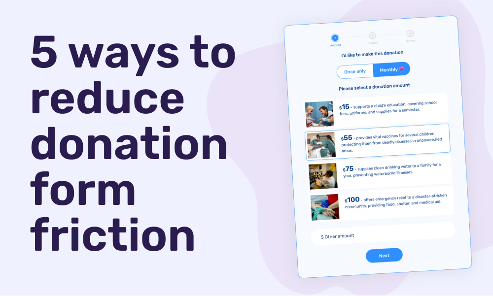
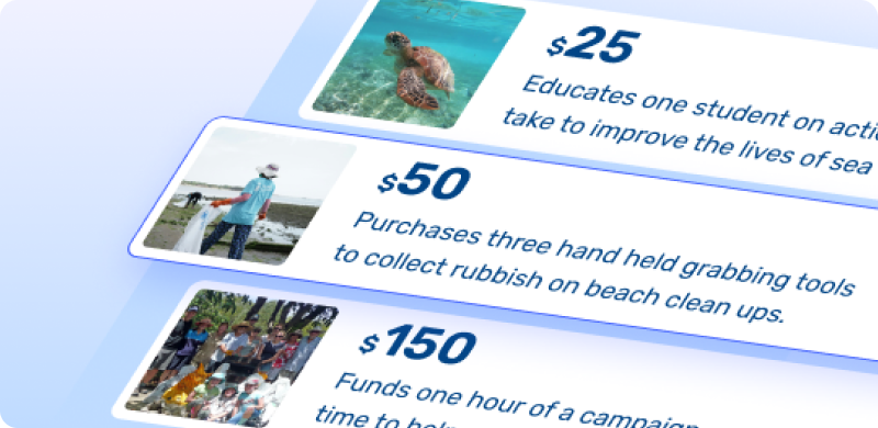
1. Clarify the impact of the gift
Place clear, purpose-driven messaging within your donation form. Tell supporters what their gift will help achieve. For example, instead of just saying "$30" say " $30 - provides school supplies for one student for an entire term." When people see the direct outcome of their donation, they are more motivated to give.
2.Keep a clear flow
The way your donation form looks can influence whether someone chooses to begin or complete the process. Layout and spacing have a powerful effect on perceived effort. Using a three-step form approach shows donors which step they are on and how many steps remain. This gives a sense of progress and reduces anxiety around the unknown. As a bonus, if the first step collects name and email, you will be able to follow up with anyone who abandons the form before completing their donation.
3. Too many fields
Asking for too much information too soon is one of the most common causes of donation abandonment. Every additional field a donor must complete increases the likelihood that they will give up before finishing.
Limit your form to the essentials. In most cases, all you need is name, email, donation amount, and payment information. If you would like to ask additional questions, such as how someone heard about you or whether the gift is in honor of someone, consider collecting that information after the donation is processed. This keeps the donation experience fast and focused.
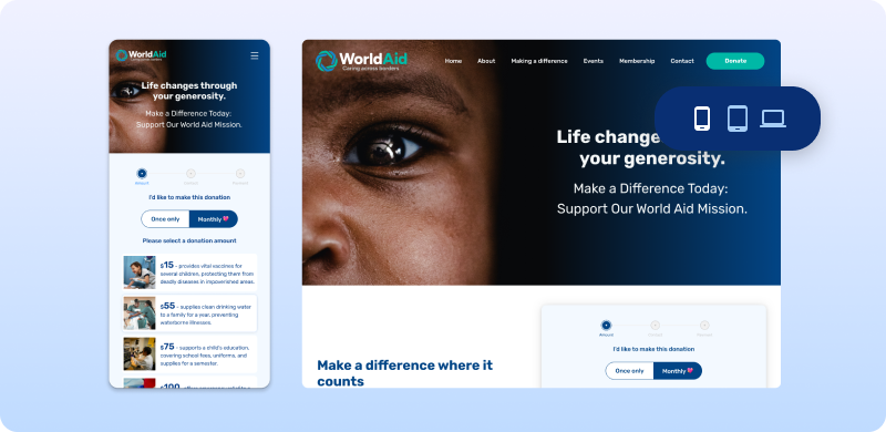
4. Make it mobile friendly
Many donors give using their phones or tablets. In some cases, more than half of a nonprofit’s donation traffic comes from mobile devices. If your form is not designed for mobile, donors may struggle with tiny text, hard-to-tap buttons, or slow page loads.
Make sure your form is responsive and easy to use on all screen sizes. Test the entire experience from start to finish on both Android and iOS devices. Forms should load quickly, fit the screen, and allow for easy scrolling and typing.
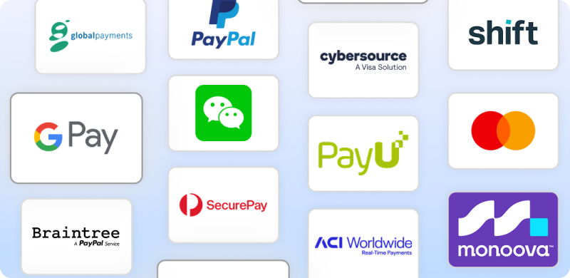
5.Diversify your giving methods
Even if your form works well, you may be missing out on donations by not offering the right payment options. Different supporters prefer different methods, and if they do not see their preferred choice, they may not complete the donation at all.
At a minimum, offer common options like Visa, Mastercard, and PayPal. If you have younger or international donors, consider adding options like Apple Pay, Google Pay, or even direct debit. Recurring donors may also want to use bank transfer or saved cards. The more flexibility you offer, the more donors you can accommodate, which directly improves your conversion rate.
Conclusion
Reducing donor friction is about making the giving process as intuitive and inviting as possible. By simplifying forms, optimising for mobile, offering diverse payment options, clarifying impact, and guiding donors with a clear flow, you can transform your donation page into a powerful tool for engagement. These changes not only boost conversion rates but also build trust and loyalty, encouraging supporters to give again. Start with one or two of these strategies, test the results, and watch your fundraising potential soar.